Scroll To Top Icon

Arriva

Designing rail experiences at national scale where accessibility, trust and choice directly impact millions of journeys.

At Arriva UK Trains, I led and designed UX across CrossCountry, Chiltern, and Grand Central, shaping the strategy and design of core digital products used by millions of passengers each year. My work focused on making rail travel more accessible, transparent and intuitive, turning complex booking and ticketing systems into confident digital experiences while directly supporting commercial growth and regulatory goals.

A snapshot of Arriva’s digital rail experience across desktop and mobile, highlighting accessible booking flows, mobile ticketing innovation, and modernised seat selection—showcasing how complex rail journeys were simplified through thoughtful UX.

Accessibility as a Differentiator

Background

Passengers with mobility or accessibility needs faced a fragmented experience when booking rail travel. This caused uncertainty, stress and in some cases even deterred travel altogether. Arriva saw an opportunity to integrate the national Passenger Assist service directly into its digital platforms, allowing customers to book journeys and assistance in a single, seamless flow.

Process

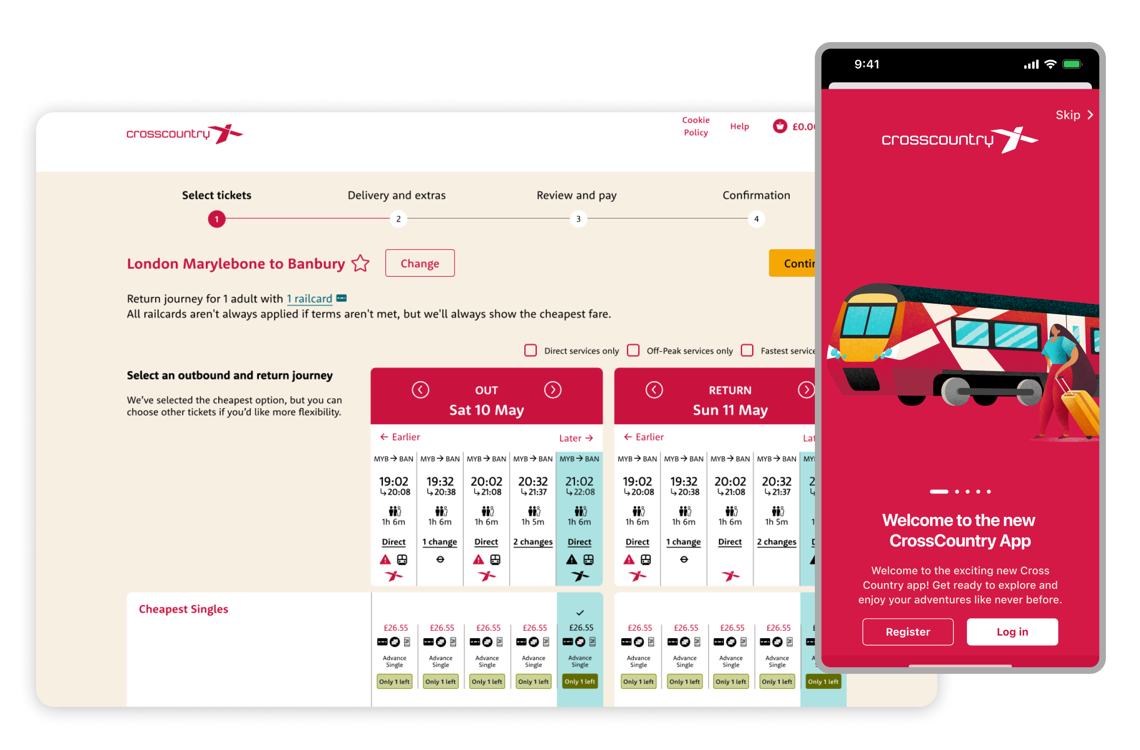
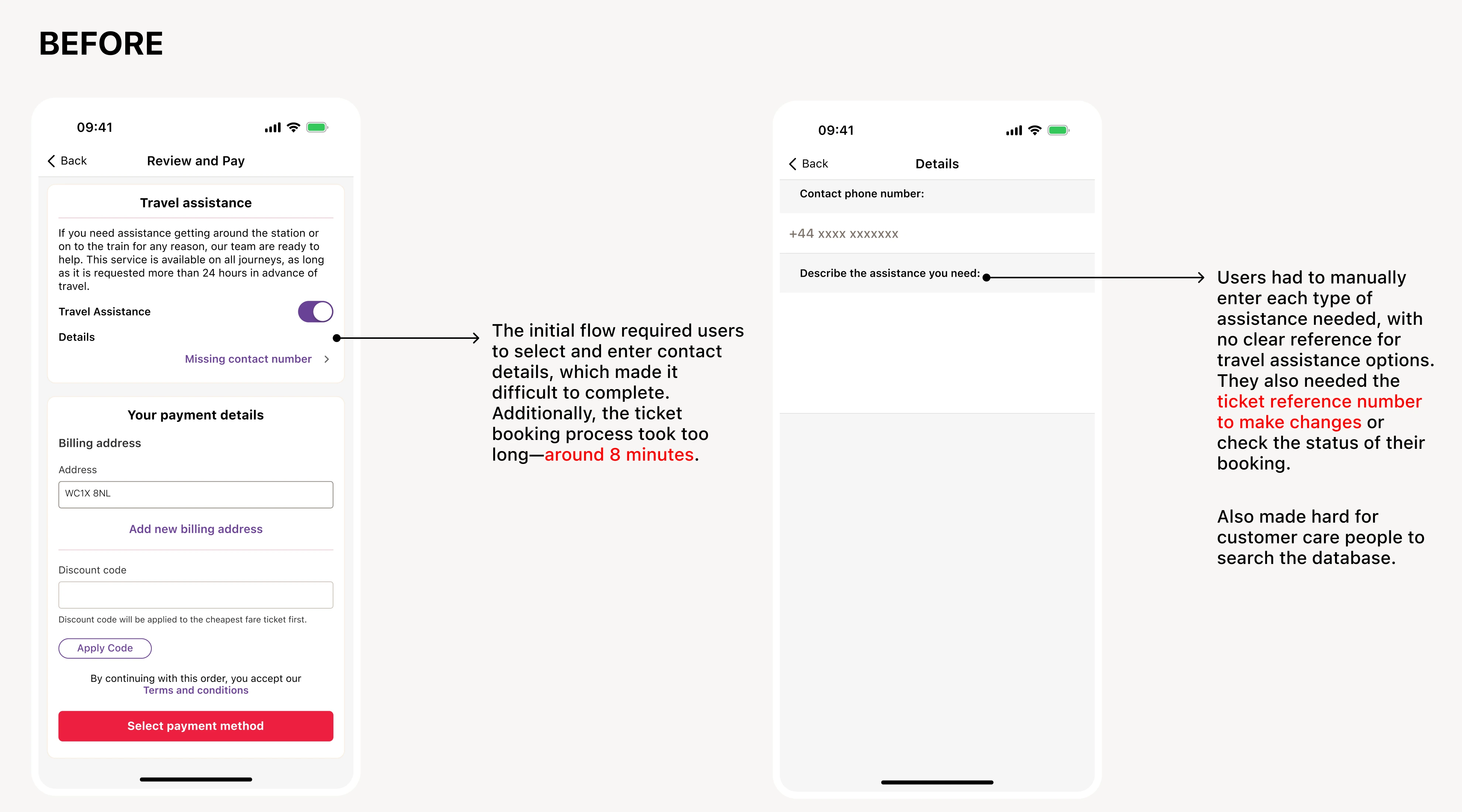
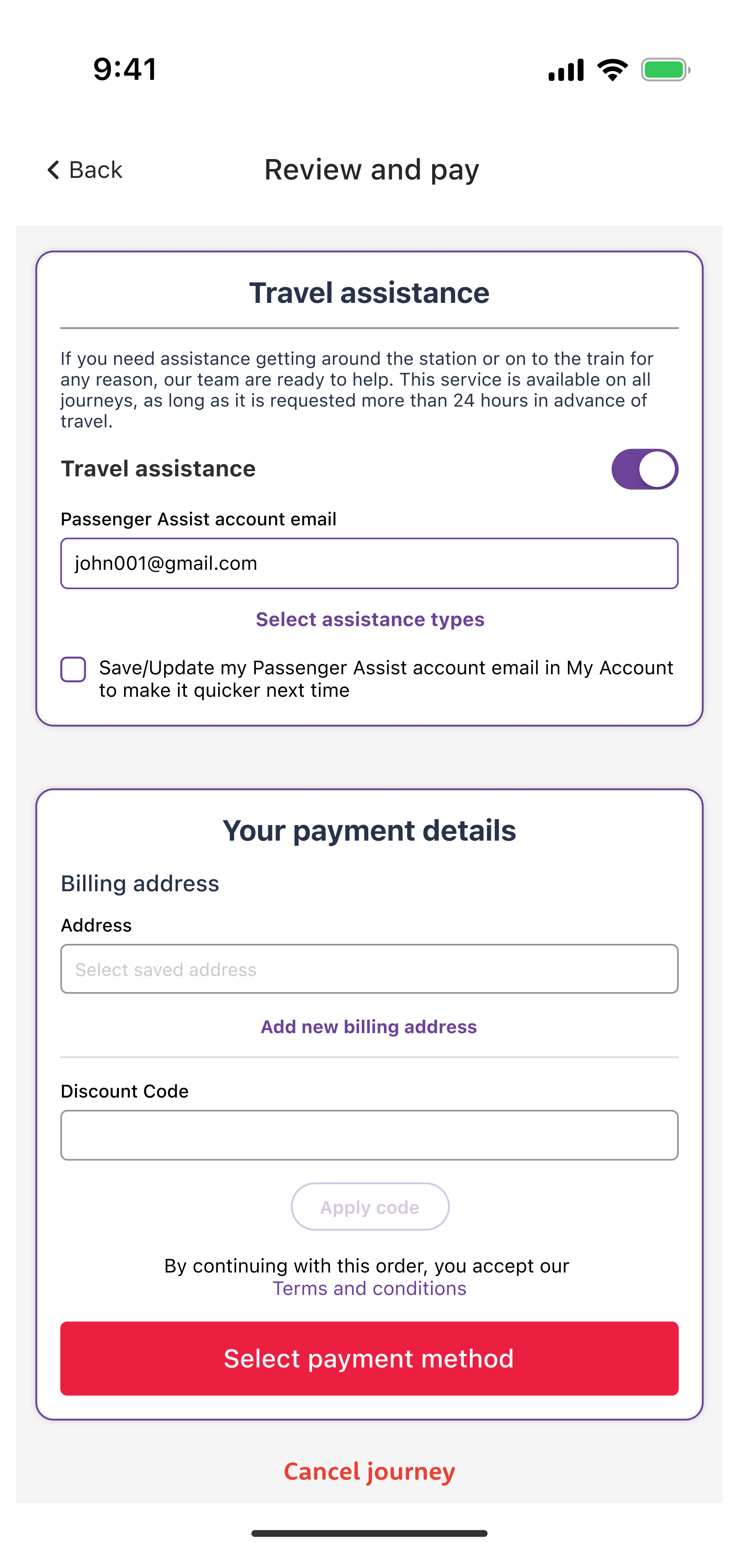
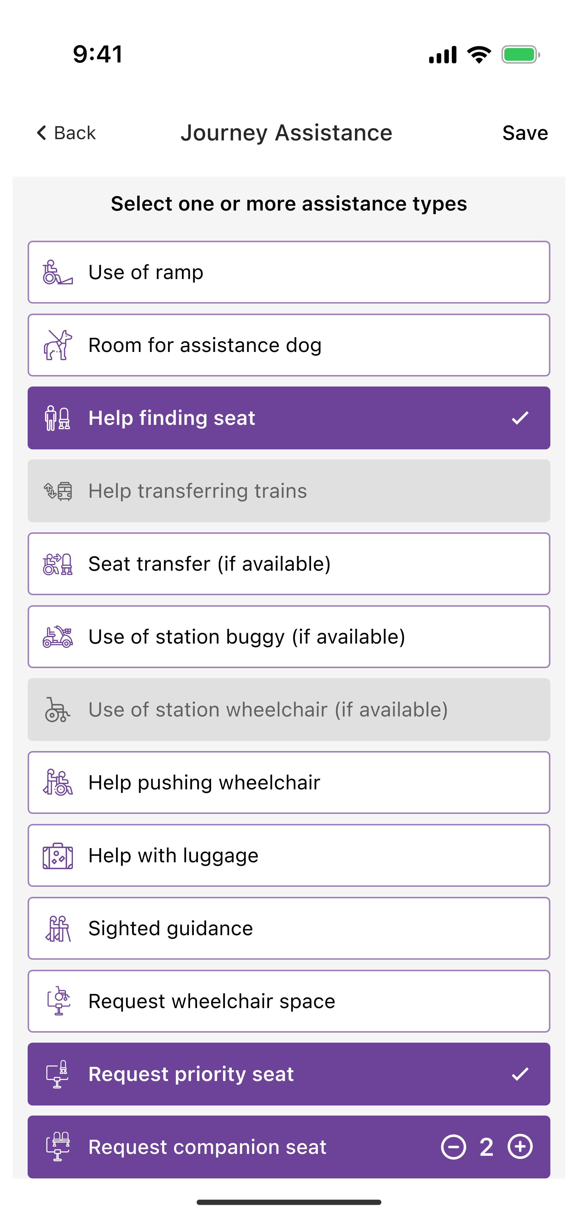
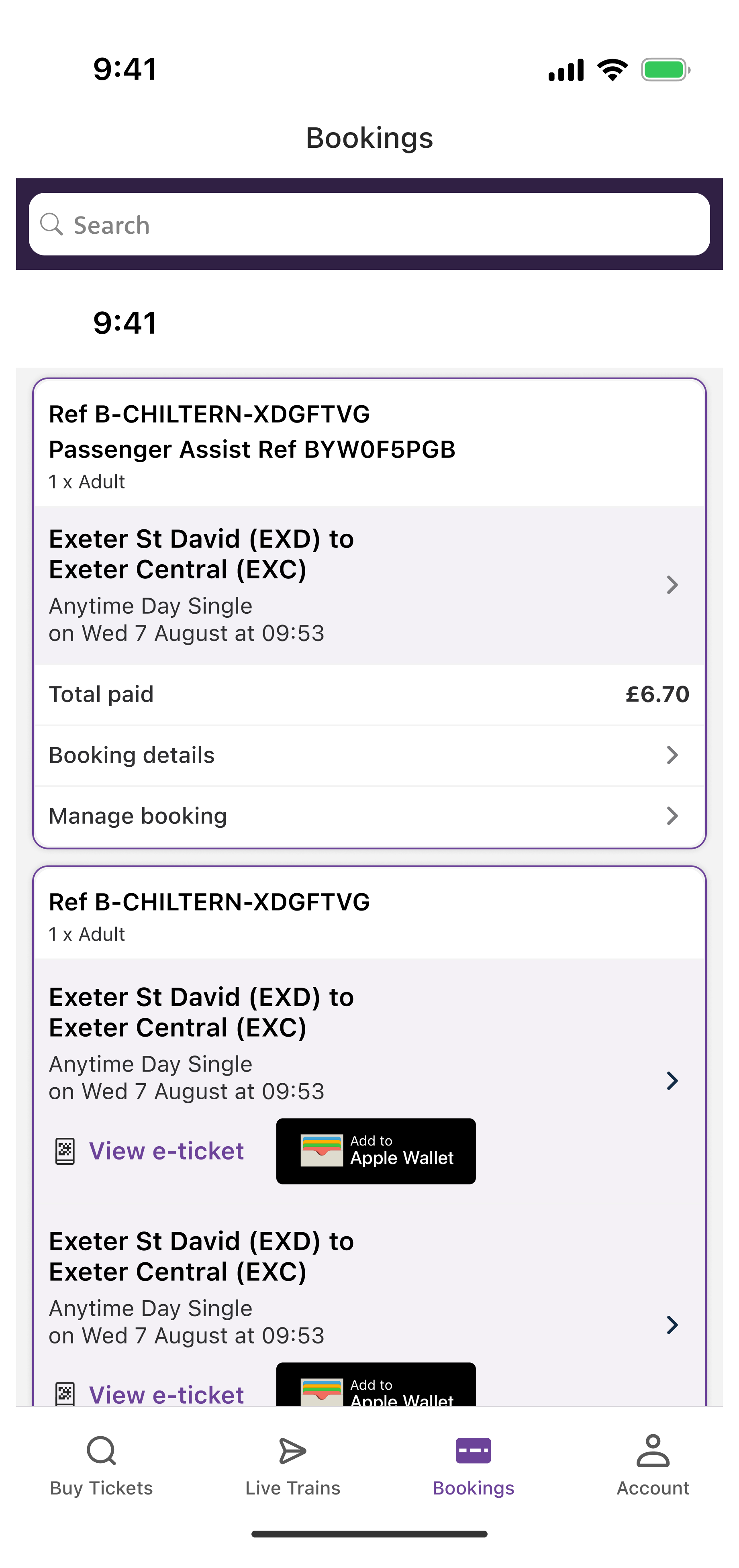
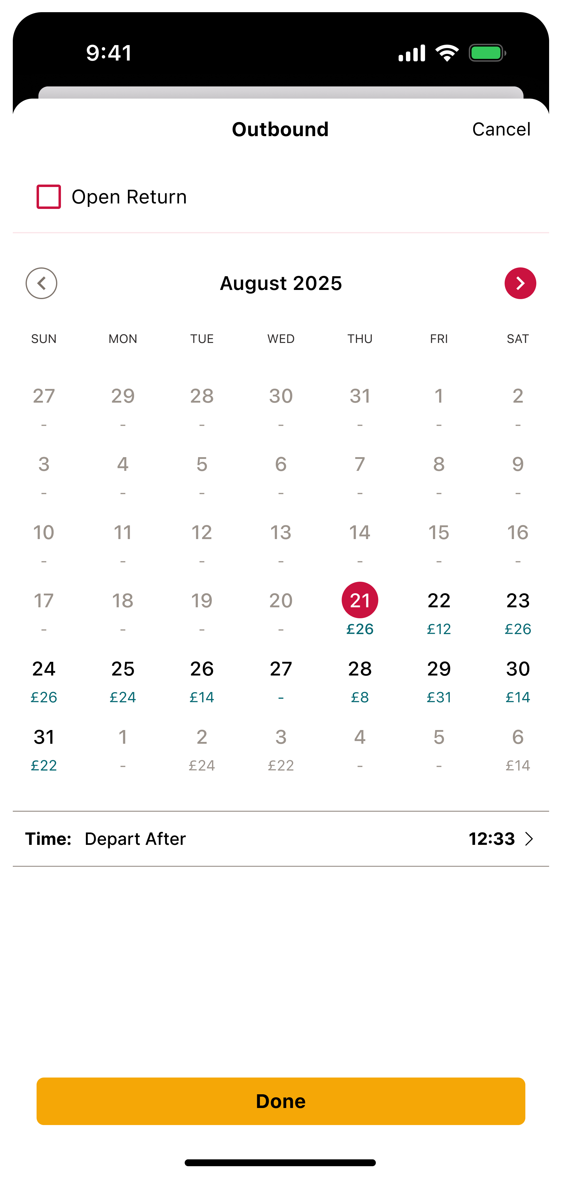
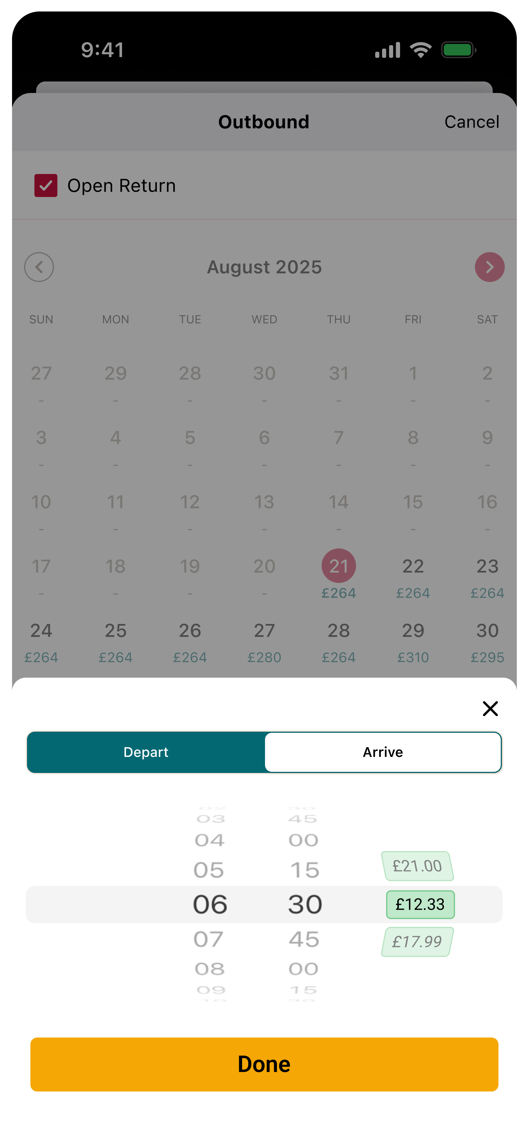
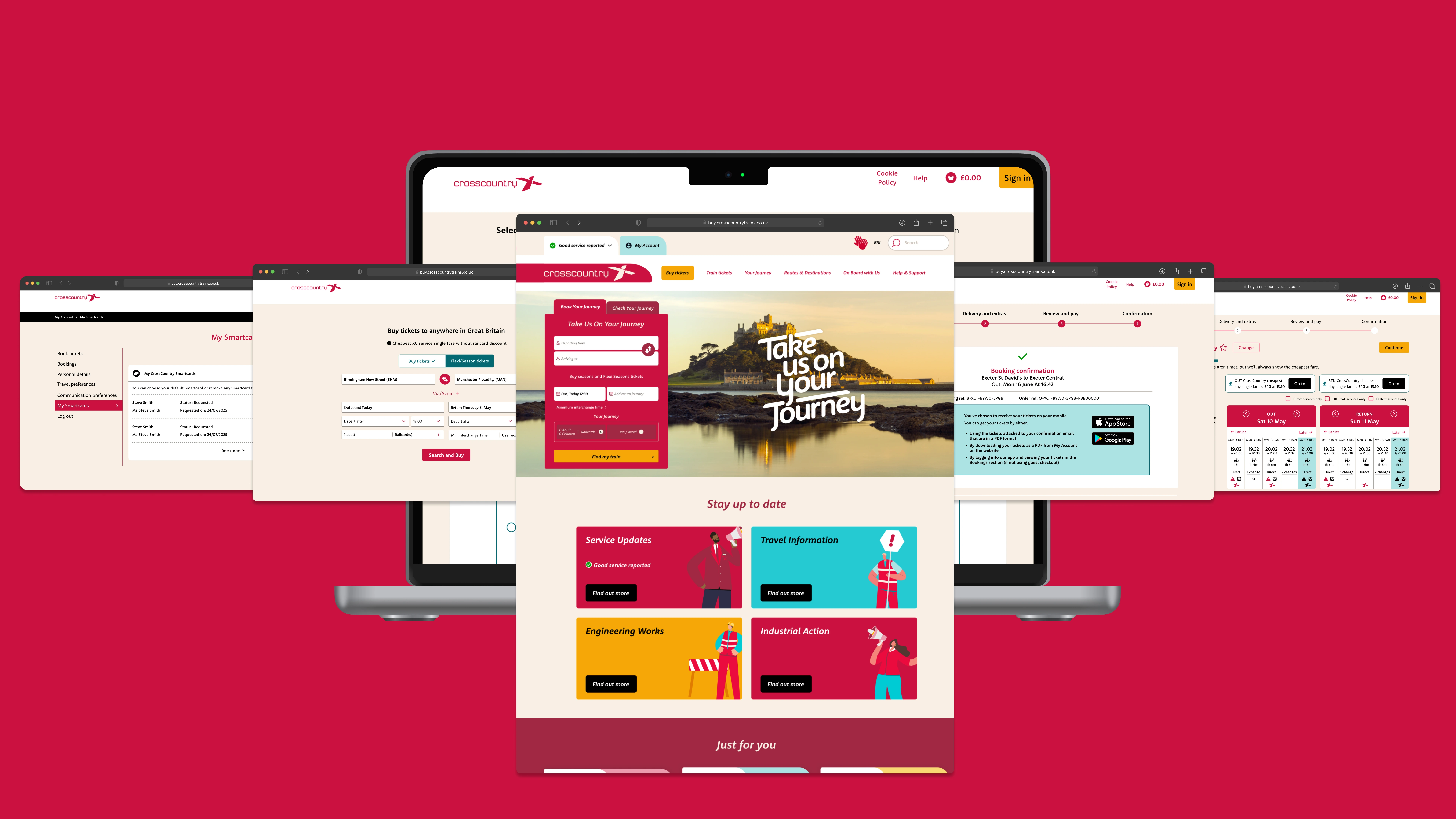
I designed a seamless “Travel Assistance” experience across web, iOS, and Android, integrating Passenger Assist directly into the booking flow. Users could link their account, specify assistance needs, and receive journey-specific validation based on station and service capabilities. The design was informed by customer service call analysis, accessibility audits, and usability testing with assisted passengers. I prioritised language clarity, resilient error states, and WCAG AA compliance to ensure the experience reduced anxiety rather than adding friction.

Result

After launch, digital requests for assistance grew by 12%. Assisted passengers reported higher confidence in planning their journeys, reflected in a 20% increase in completed assisted bookings online.

Landing Page of CrossCountry

AFTER

Travel Assistance Selected

Assistance Flow

Enables passengers to request assistance during booking, removing the need for phone calls.

Passenger Assist Types

Assistance Types

Allows users to specify exact support needs, reducing ambiguity at stations.

Booking Passenger Assist Reference Number

Assistance Reference No

Confirms successful booking and builds confidence before travel.

Designing Transparency to Win Trust

Background

Many passengers found UK rail fares confusing, with multiple options for the same journey and little clarity on which ticket offered the best value. This often led to frustration, mistrust and abandoned bookings especially for complex or longer-distance trips. Passengers wanted a simple, transparent way to quickly identify the lowest fare without trial and error across multiple searches.

Process

I designed the Cheapest Fare Finder to surface the best available prices directly within the booking flow. This included calendar-based views for long-term planning and time-based fare indicators for quick decision-making. Through usability testing with price-conscious travellers, we refined entry points and visual hierarchy to ensure the tool felt helpful rather than overwhelming.

Result

The feature delivered a 6% uplift in conversion for journeys where it was available, attracted new customers through low-fare campaigns, and reduced fare-related complaints by 30%.

Cheapest Fare Calendar

Fare Calendar

Surfaces the lowest fares across days to support flexible planning.

Time Cheapest Tag

Time based Fare

Highlights the cheapest departure options at a glance.

Cheapest Tag

Cheapest Tag and Banner

Draws attention to the best deals with prominent tags and banners.

From Information Hub to Sales Engine

Background

CrossCountry wanted a complete redesign of its marketing website to better reflect the brand and meet modern customer expectations. The previous site was inconsistent with the app, difficult to navigate, and under-optimised for both accessibility and search. As the primary digital touchpoint for new and returning passengers, the site needed to deliver a seamless experience, showcase new brand colours and illustrations, and integrate directly with the ACE ‘Buy Tickets’ engine to drive sales.

Process

I led the creation of a new CrossCountry design system to unify brand expression across web and app while embedding accessibility and scalability from the outset. Over 30 reusable templates and components were designed to support journeys, campaigns, and content at scale. Navigation and content structure were reworked to prioritise booking and discovery, balancing marketing needs with commercial performance.

Result

The redesigned site has recently launched and early signals are promising. We are currently validating performance metrics, with focus areas including organic traffic growth, bounce rate reduction and uplift in direct online bookings. The relaunch positions CrossCountry with a refreshed, modern brand presence while creating a scalable foundation for future campaigns and product integrations.

Landing Page of CrossCountry

Scaling Design Across Mobile Platforms

Background

CrossCountry’s mobile apps were underperforming compared to competitors, with inconsistent design patterns, dated booking flows and mixed reviews. Improving usability and achieving feature parity with web was critical to customer growth and retention.

Process

I helped establish a unified design system applied consistently across iOS and Android, ensuring alignment with native Apple Human Interface Guidelines and Google Material Design principles. This created a familiar, intuitive experience for users regardless of device. I redesigned the end-to-end booking flow to reduce drop-off and improve clarity. Additional enhancements included real-time journey updates, streamlined account management and redesigned notification patterns to increase engagement.

Result

The redesigned apps have recently launched, and we are in the process of validating key performance metrics. Early signals are promising, with particular focus on improvements in app store ratings, active user growth and booking conversion rates. The relaunch positions mobile as a core revenue and engagement channel for CrossCountry, with a scalable design foundation for future iterations.