Designed Trust into an Offline Crypto Wallet for users
Product Designer
3 months
Cryptocurrency
7 people
CloudCoin users couldn't see their money move and that killed trust. As one of two designers, I owned the web wallet and mobile apps, redesigning onboarding, transfers, and recovery flows to make an invisible system feel tangible. Result: 37% higher retention, 40% fewer transfer errors, and time-to-first-transaction cut from 4.5 minutes to 2 minutes.
One of two product designers. I owned the web wallet, mobile apps (iOS + Android), and design system. A second designer owned the offline desktop wallet.
7 people: 1 PM, 2 designers, 3 engineers, 1 Marketing. I owned web + mobile. The other designer owned the desktop wallet. We synced weekly on shared patterns like offline states and recovery flows.
CloudCoin is an offline-first cryptocurrency designed for security, privacy, and energy efficiency. Unlike traditional crypto wallets, users do not see real-time blockchain confirmations or continuous balance updates.
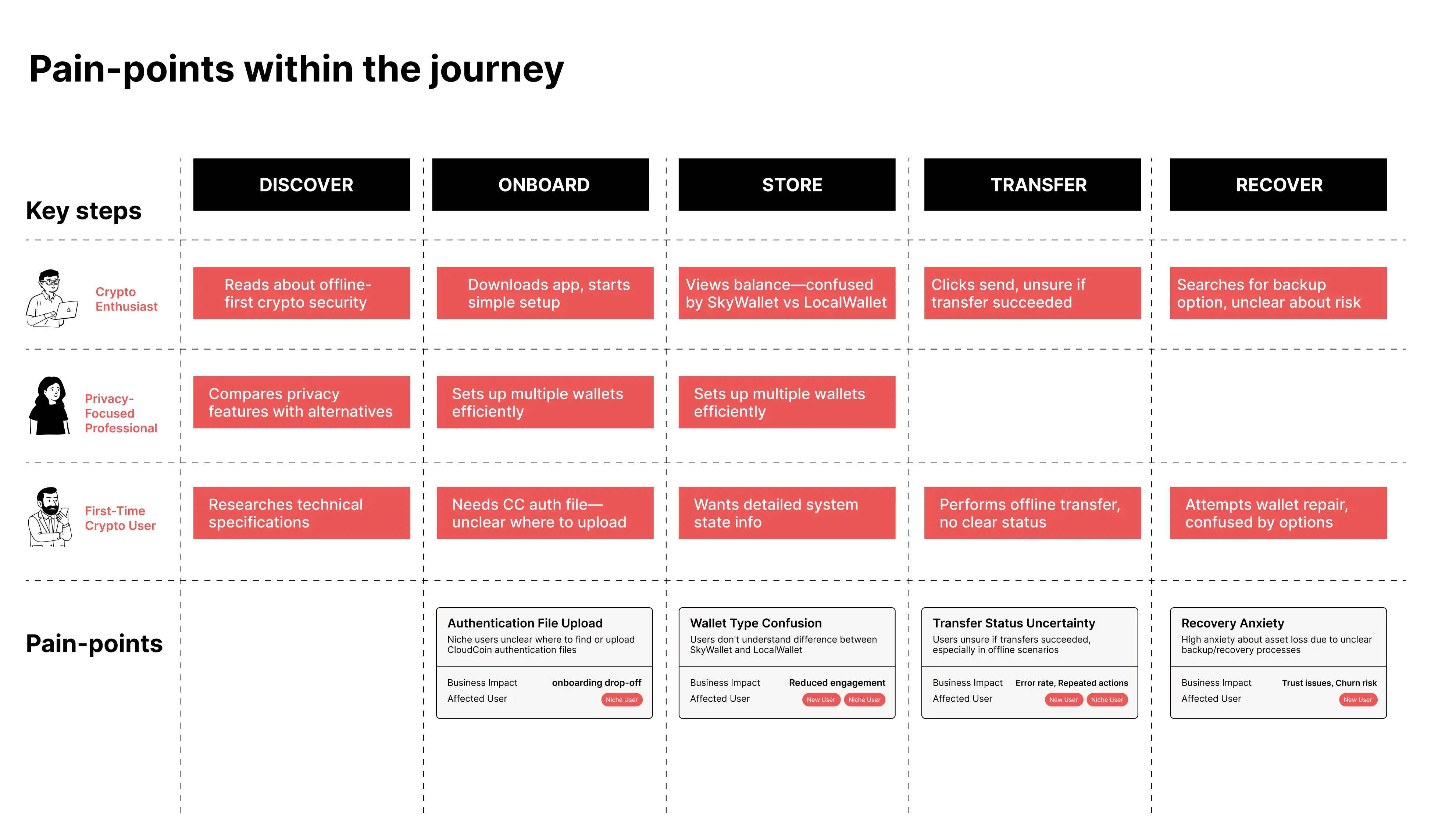
The challenge was fundamental. Users were asked to trust money they could not see moving in real time, authenticate wallets using unfamiliar files, and manage assets across local and cloud-based wallets.
The technology worked. The experience did not.
Users struggled to translate intent into action during their first session.
Transfer feedback lacked clarity around progress, success, and failure states.
Core security features were only understood once something went wrong.
The company needed to demonstrate improved retention before a critical investor milestone tied to future funding. The wallet had become the bottleneck to ecosystem growth. If users could not trust it, CloudCoin could not scale.
To identify where trust was breaking down, I led an independent research effort combining qualitative interviews, support ticket analysis, and session recordings. Over two weeks, I conducted 15 user interviews across beginners, privacy-focused professionals, and experienced crypto users, observing them complete real tasks like onboarding, transfers, and recovery while thinking aloud.
A clear pattern emerged. Users did not struggle because the system was unusable, but because its behavior was invisible. Authentication steps felt unexplained, transfers lacked feedback, and recovery tools were only discovered after something went wrong. This insight shaped every design decision that followed.
"I don't know where my coins actually are, and that scares me."
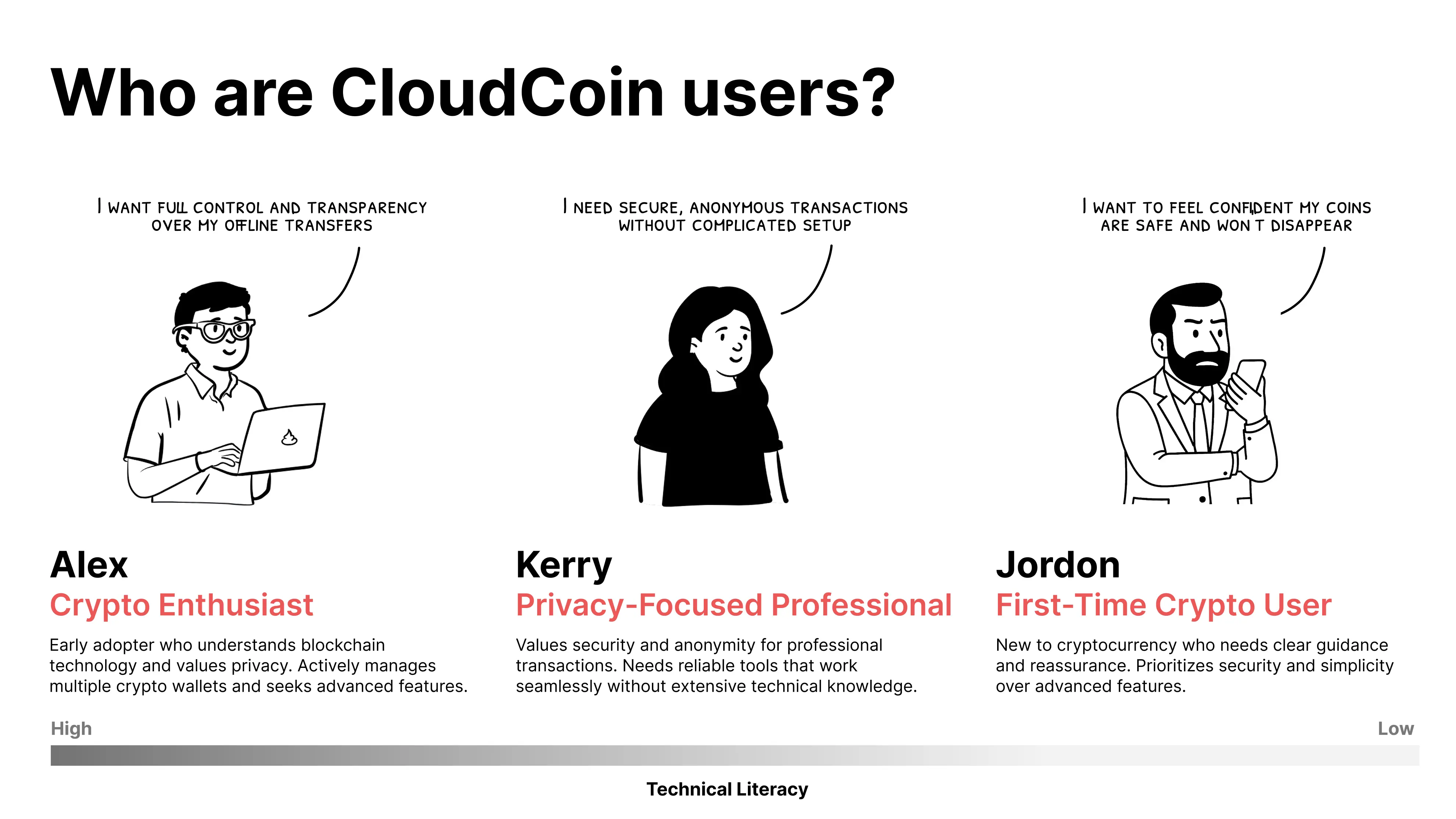

Users need to feel their money exists somewhere real.

Financial tools should behave like banking, not infrastructure.

At every moment, users should know what is happening and what comes next.
In multiple cases, I chose clarity over speed, even when it meant adding steps.
I focused on core problems that had the most strategic and user impact:
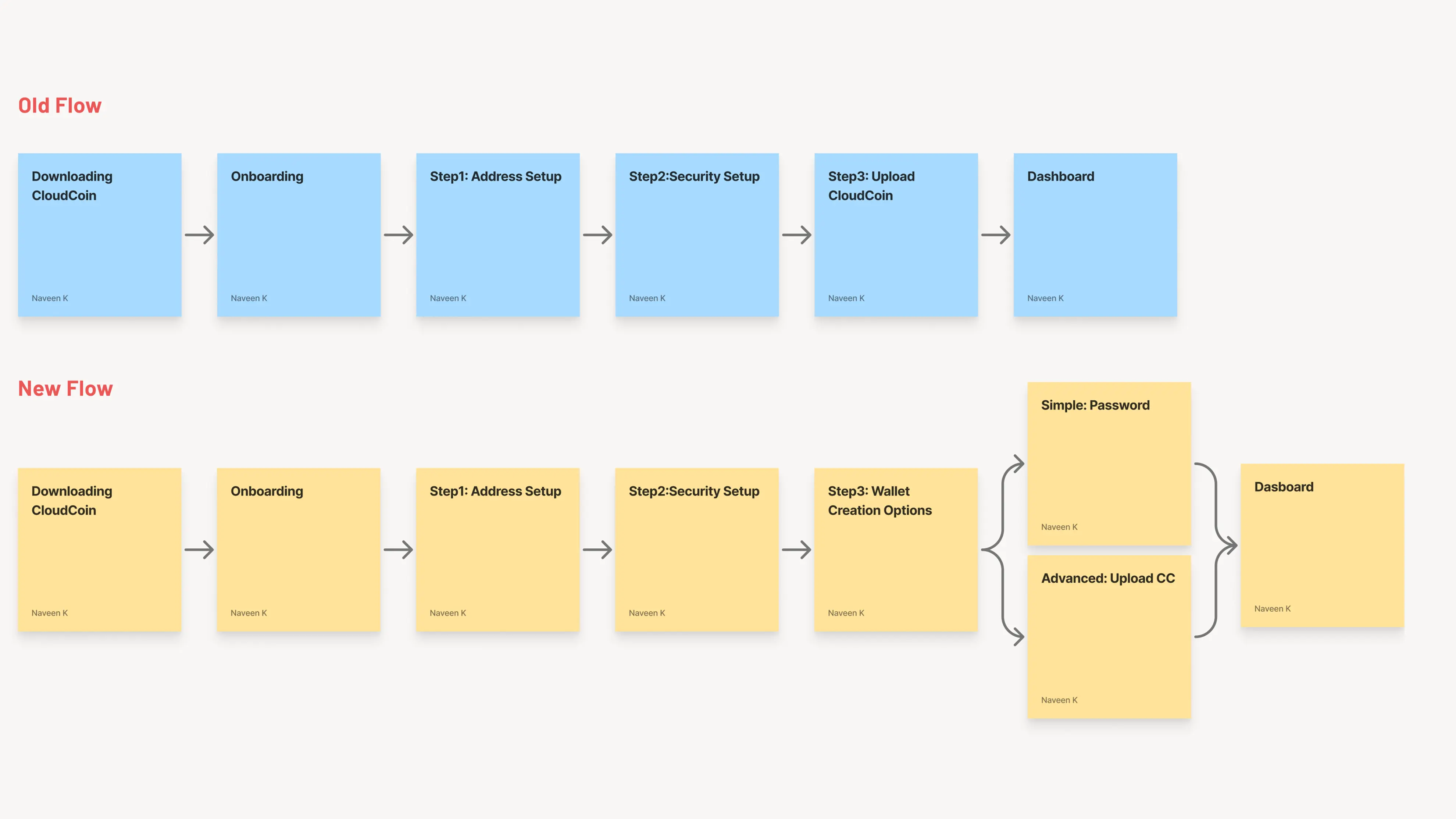
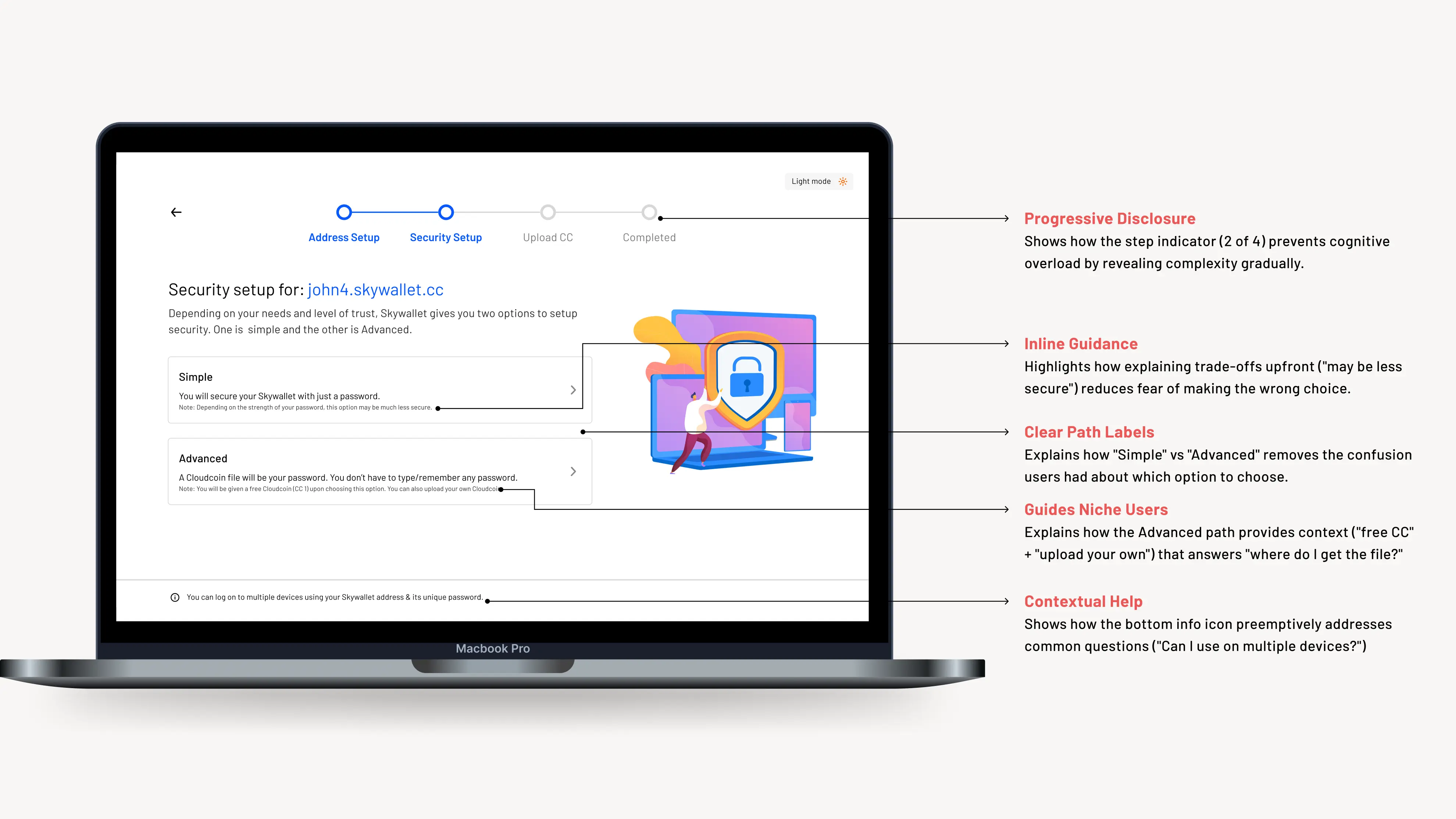
Onboarding broke down when users were asked to upload an unfamiliar authentication file without understanding its purpose or consequences. To reduce hesitation without hiding complexity, I split onboarding into Simple and Advanced paths after clearly explaining the trade-offs.
Impact: Onboarding drop-offs decreased and authentication-related support tickets dropped significantly.
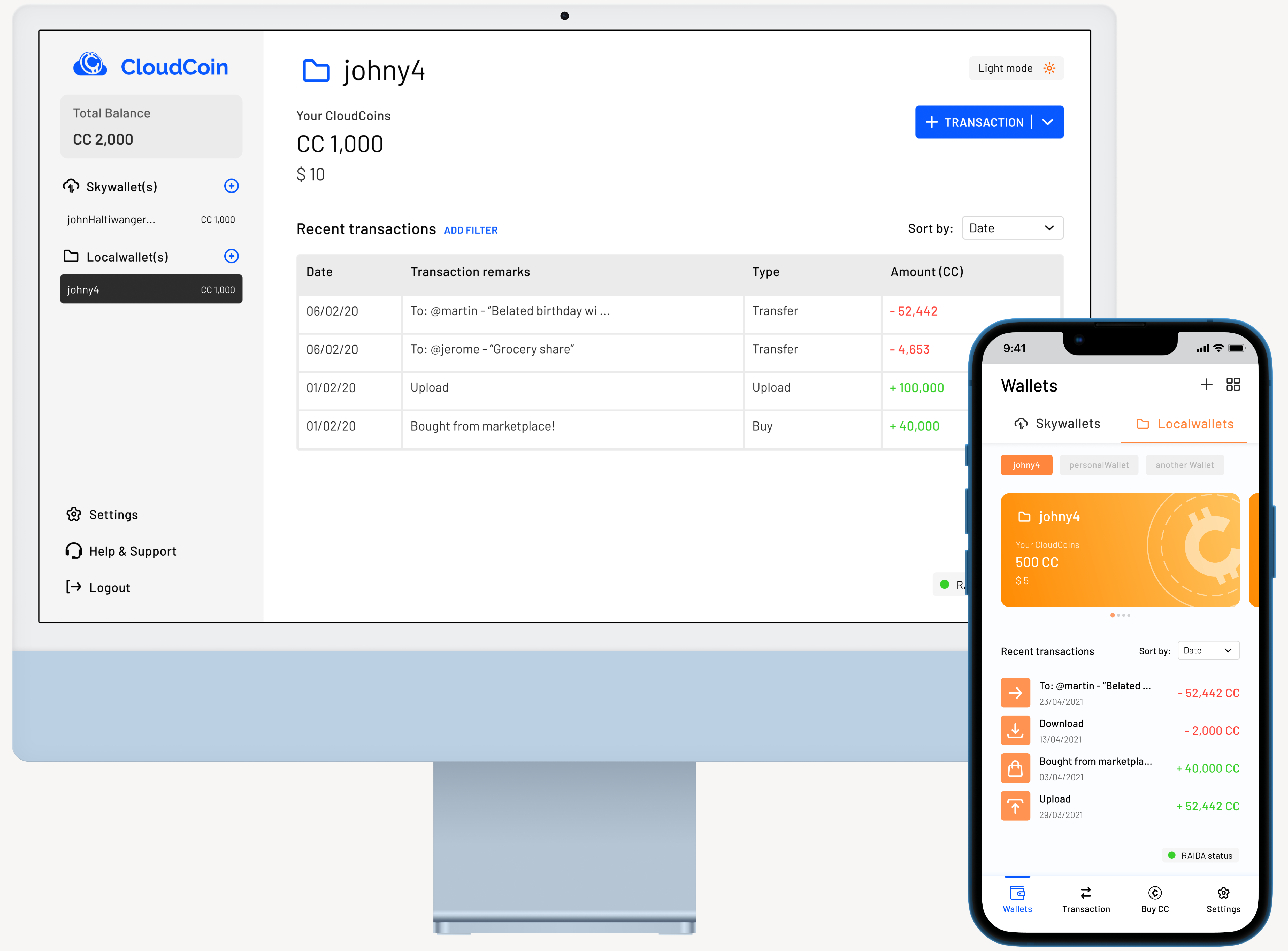
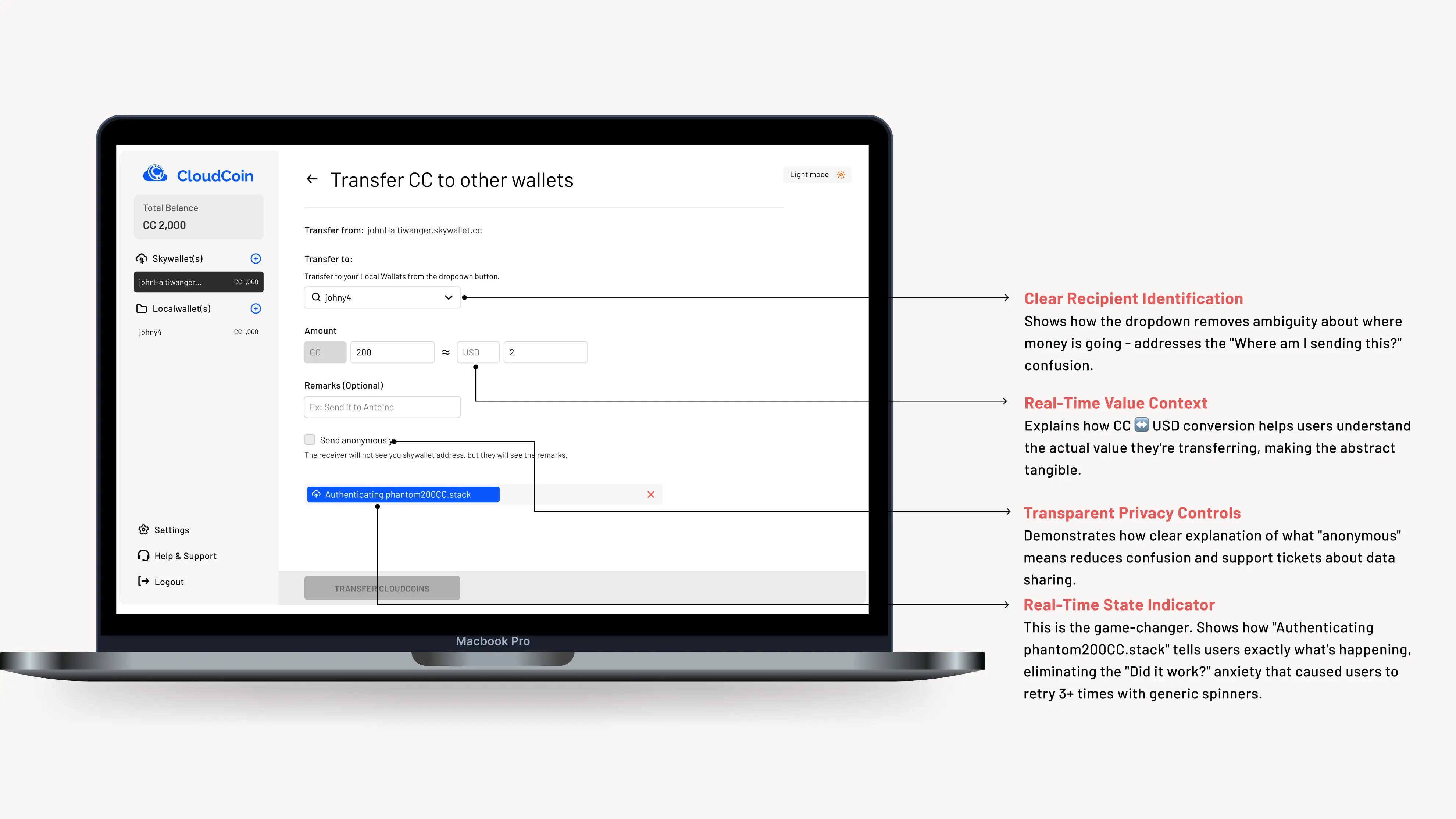
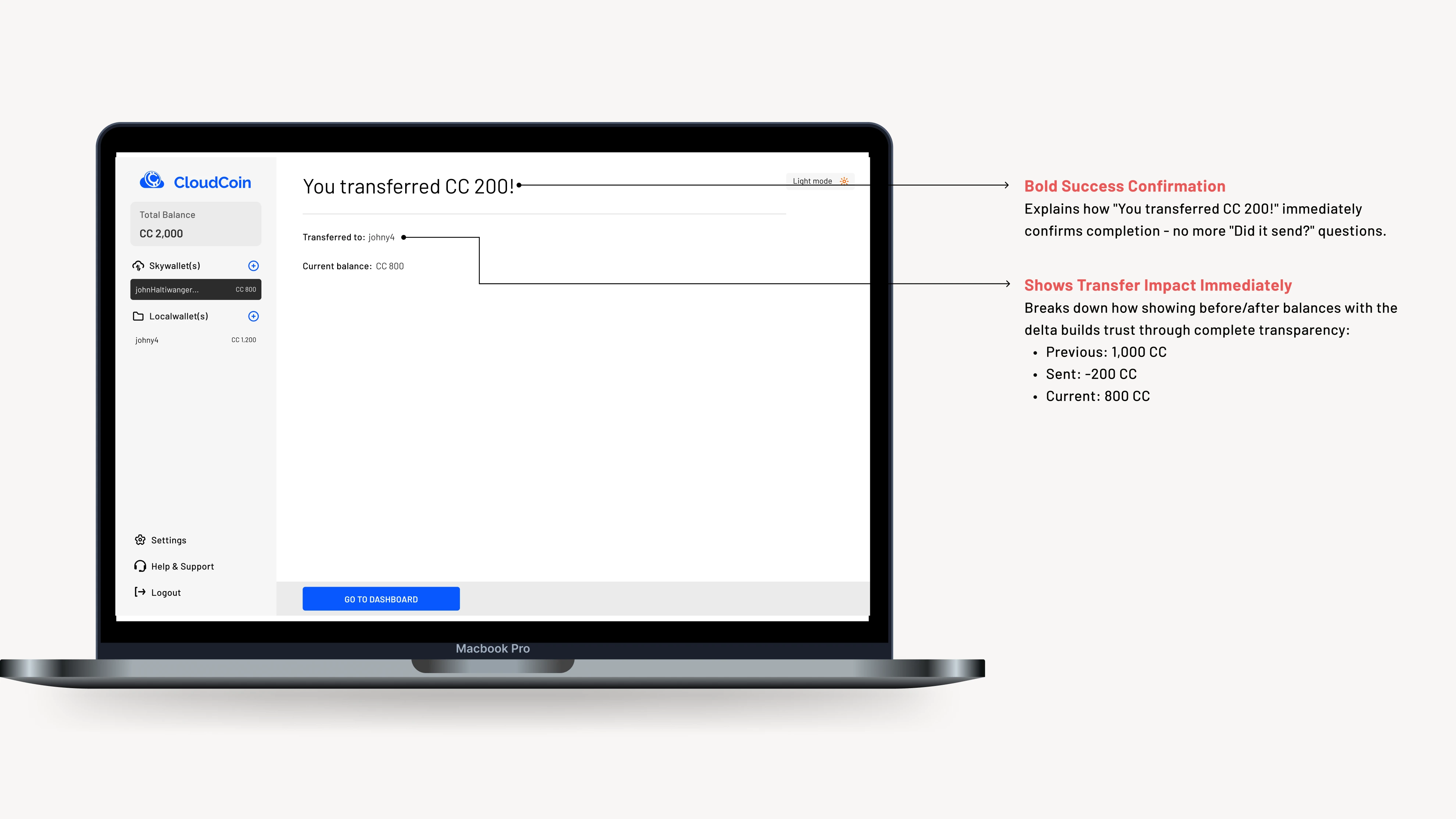
Transfers felt risky because users could not tell whether anything was happening, especially in offline scenarios. I redesigned the flow around explicit system states that showed progress, intent, and outcome. Instead of a single loading spinner, users saw clear stages that made the transfer feel deliberate and controlled.
Impact: Duplicate transfer attempts were eliminated in testing, and transfer-related errors dropped post-launch.
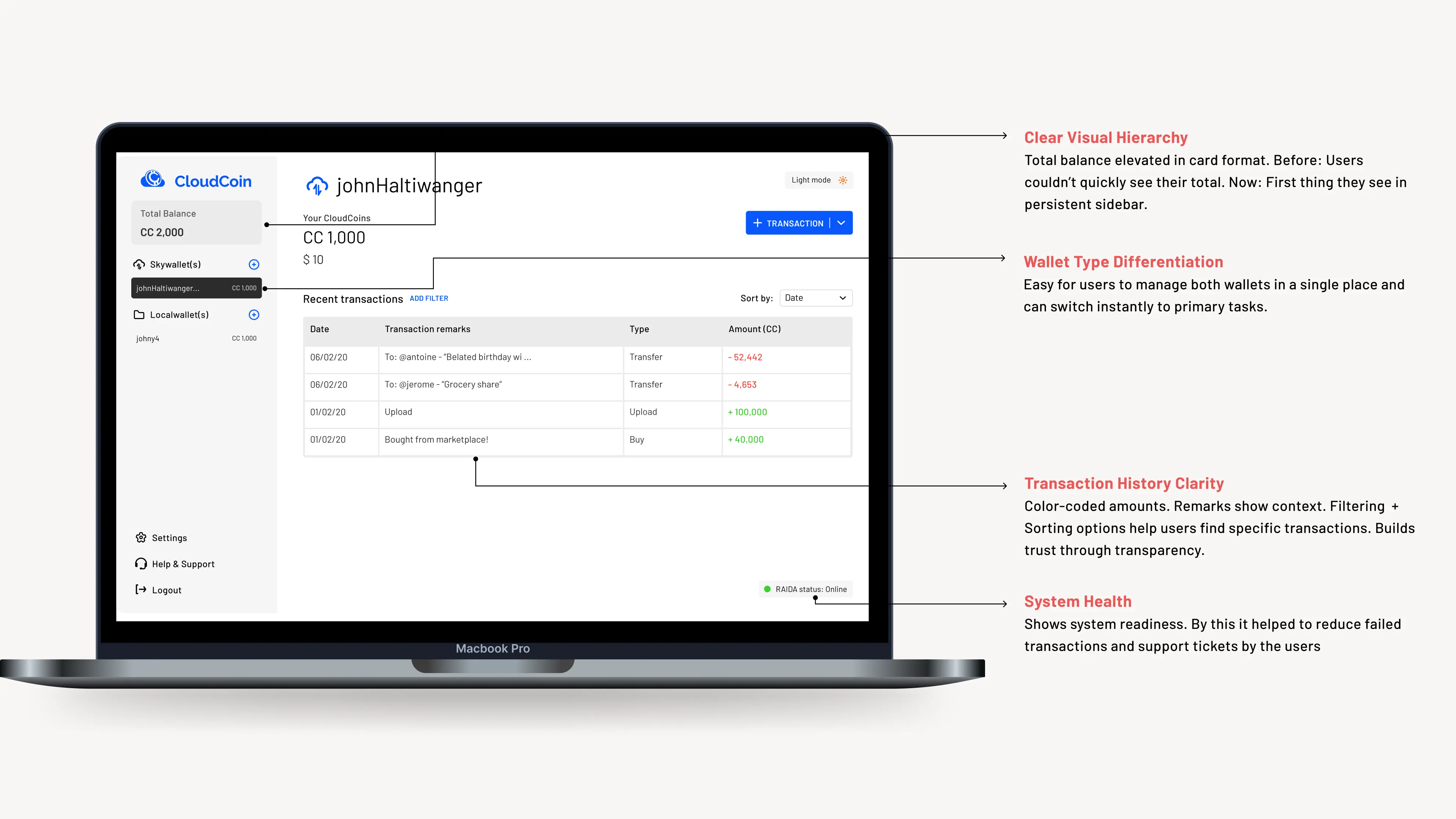
Users could see their balance but did not understand wallet health, sync status, or readiness to act. I redesigned the dashboard to prioritize state clarity over information density. By simplifying hierarchy and surfacing system status visually, users could quickly understand whether their wallet was ready, syncing, or required attention.
Impact: Task completion rates improved and daily engagement increased.
Backup and recovery tools were ignored until failure occurred, at which point users panicked. I redesigned these flows to feel guided, predictable, and reversible. By breaking recovery into clear steps and adding safeguards before destructive actions, users felt more confident engaging with protection features proactively.
Impact: Backup success rates increased significantly and emergency support requests declined.
The mobile app was designed to deliver the core CloudCoin experience within a constrained environment while preserving clarity and trust. It supports all essential flows and select advanced features, offering a simple entry point for new users and a familiar experience for existing ones.
Information architecture ensured consistency between the desktop, web-based wallet, and mobile app. Built natively for Android and iOS, the mobile experience follows platform-specific accessibility guidelines and interaction standards rather than mirroring the responsive web wallet.
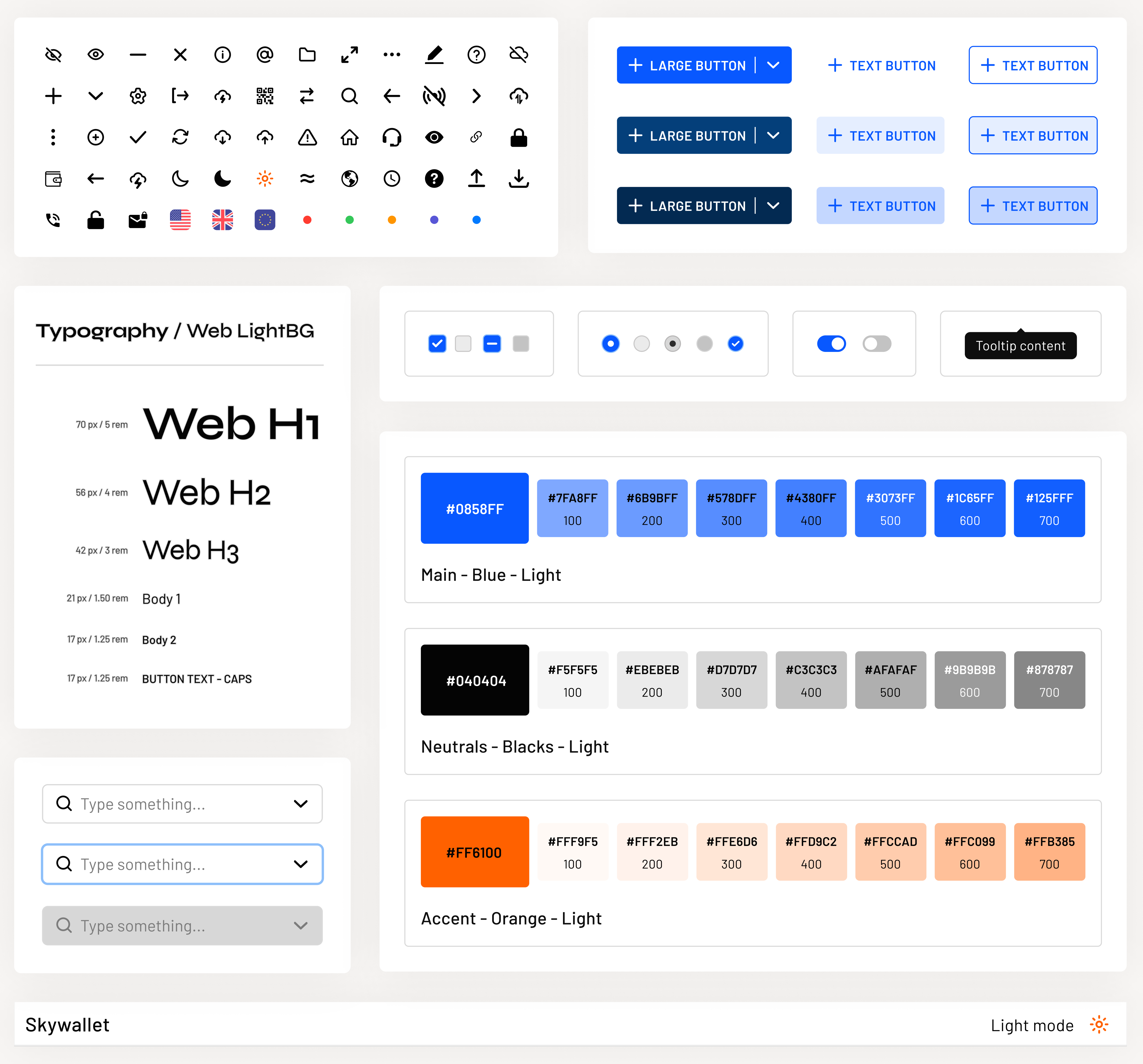
I established a scalable design foundation for CloudCoin by creating reusable components, standardizing state patterns for offline behavior, and defining accessible color and typography optimized for financial data. This system not only ensured consistency across the wallet but also supported future CloudCoin products and reduced design-to-development time.
To build credibility and trust, I designed CloudCoin's digital notes with seven distinct visual directions, testing variations in color, typography, and hierarchy. The goal was to make each note feel tangible and secure, like physical currency, while embracing the flexibility of a digital-first product. These explorations informed a visual system that could scale across wallets and features without compromising trust.
Due to the early-stage nature of the product, metrics represent directional improvements measured over the first 3 weeks post-launch.
From 23% → 31.5%, driven by clearer onboarding and reduced early drop-offs.
From ~18% error rate → ~11%, result of explicit state feedback and confirmation patterns.
Attributed to improved wallet confidence and repeat transaction behavior.
Reduced from 4.5 minutes → ~2 minutes by simplifying authentication flow.
"Nothing is happening" is the most dangerous state. In offline systems, silence feels like failure. I learned to design explicit "waiting" and "processing" states as carefully as success states. A loading spinner isn't feedback, a stage indicator with context is.
Trust isn't built by hiding complexity; it's built by explaining it. Users didn't need simpler authentication. They needed to understand why the file mattered. The moment we added one sentence of context, hesitation dropped.
Adding steps can reduce friction. Counterintuitively, breaking transfers into explicit stages made them feel faster and safer. Users said the old single-step flow felt "rushed and risky." More steps, more clarity, more trust.
CloudCoin's wallet now works. The next opportunity is making it proactive.
The foundation is trust. The next phase is confidence.