Scroll To Top Icon

Designing a landing page that connects and converts

The thumbnail is a graphical user interface for the Heiroom landing page inside a iPad and iPhone mockup.

Role

UX/UI Designer

Duration

4 weeks

Industry

Social Media

Team

Development Team, Marketing

Responsibilities

Workshop Facilitation, Competitor Analysis, UX Design, UI Design, User Testing, Design System, Prototyping, Responsive Design

Overview

Heiroom is a family-focused social platform aimed at fostering safe, engaging digital experiences. Our challenge was that the initial landing page failed to communicate the platform’s value clearly, leaving users uncertain about subscriptions and interactive features. I led a research-driven redesign, synthesizing qualitative insights, competitive analysis, and iterative user testing to refine messaging, clarify subscription tiers, and showcase the platform’s interactive storytelling.

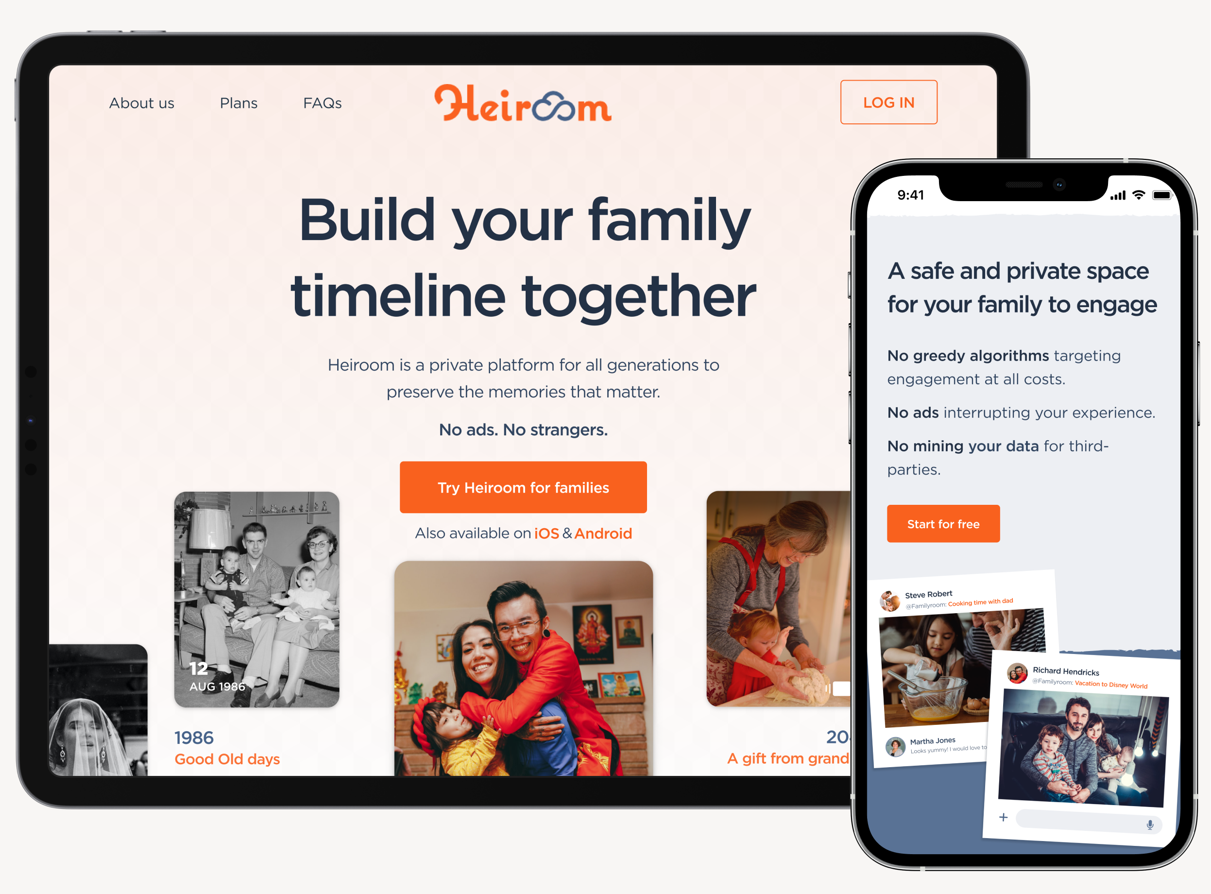
Challenge - Heiroom’s original landing page, which experienced a poor conversion rate of less than 2%, failed to clearly communicate its family-focused value, leaving users confused about subscription tiers and platform purpose. The challenge was to craft a concise, credible, and engaging experience that immediately conveyed trust, clarity and differentiation, driving both understanding and adoption.

Heiroom's targeted user groups

Number 1 Bullet Point
Privacy-conscious parents – concerned about online safety for children.
Number 2 Bullet Point
Active social media users – familiar with mainstream social platforms, expecting interactivity.
Number 3 Bullet Point
Families separated geographically – looking for shared digital spaces.
Number 4 Bullet Point
Baby boomers – less familiar with digital interfaces, emphasizing simplicity.
Positioning target groups early helped guide design decisions and ensured solutions addressed their specific pain points.

Approach

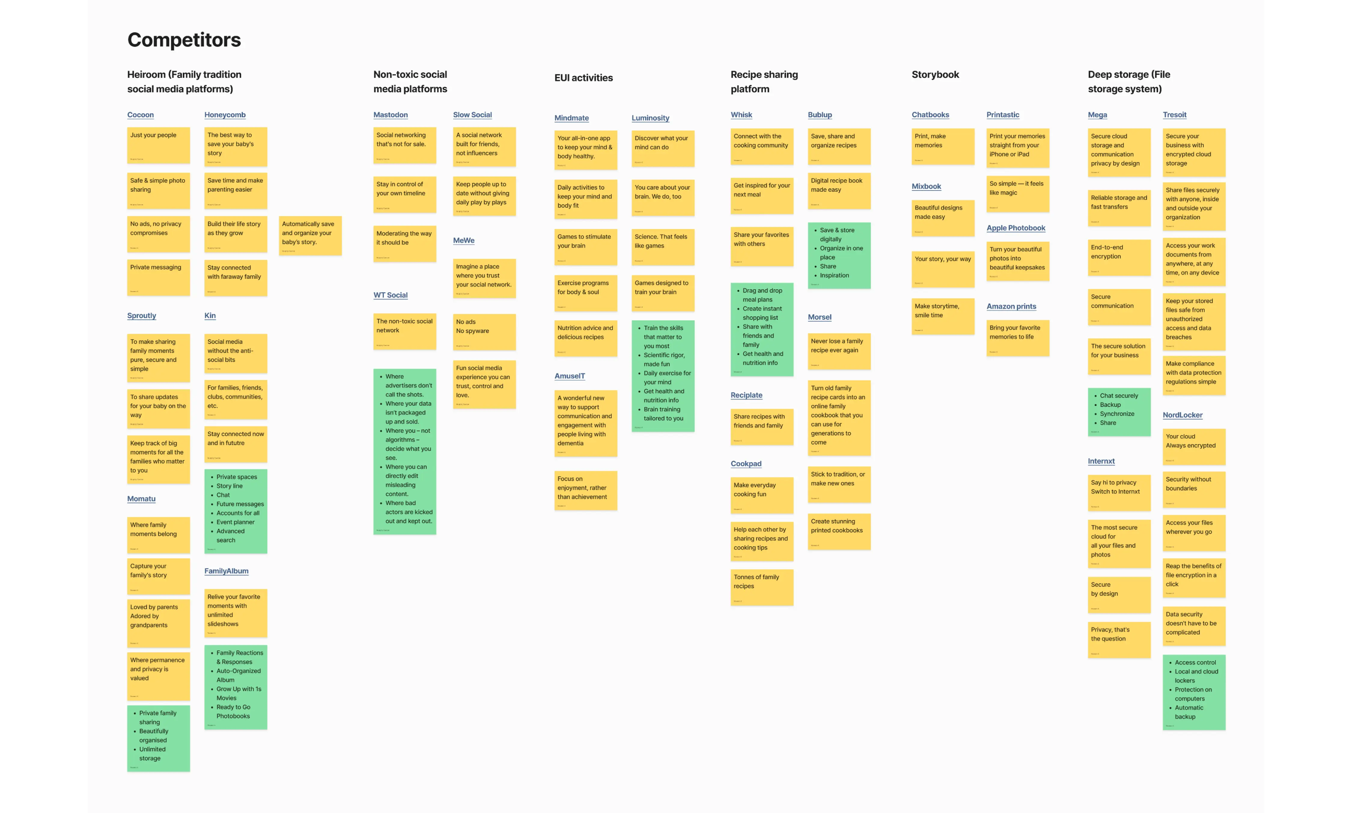
I began by aligning with stakeholders on Heiroom’s long-term vision and commercial intent, then translated that into a clear value proposition for the landing page. From there, I conducted a comparative analysis across both direct and indirect competitors—from family-focused social platforms to storage, storytelling, and activity-based products—to understand where Heiroom truly differentiated. This surfaced a critical insight: while many products owned features, none owned family continuity over time. To ensure the landing page reflected what actually mattered to users (not just what the product could do).

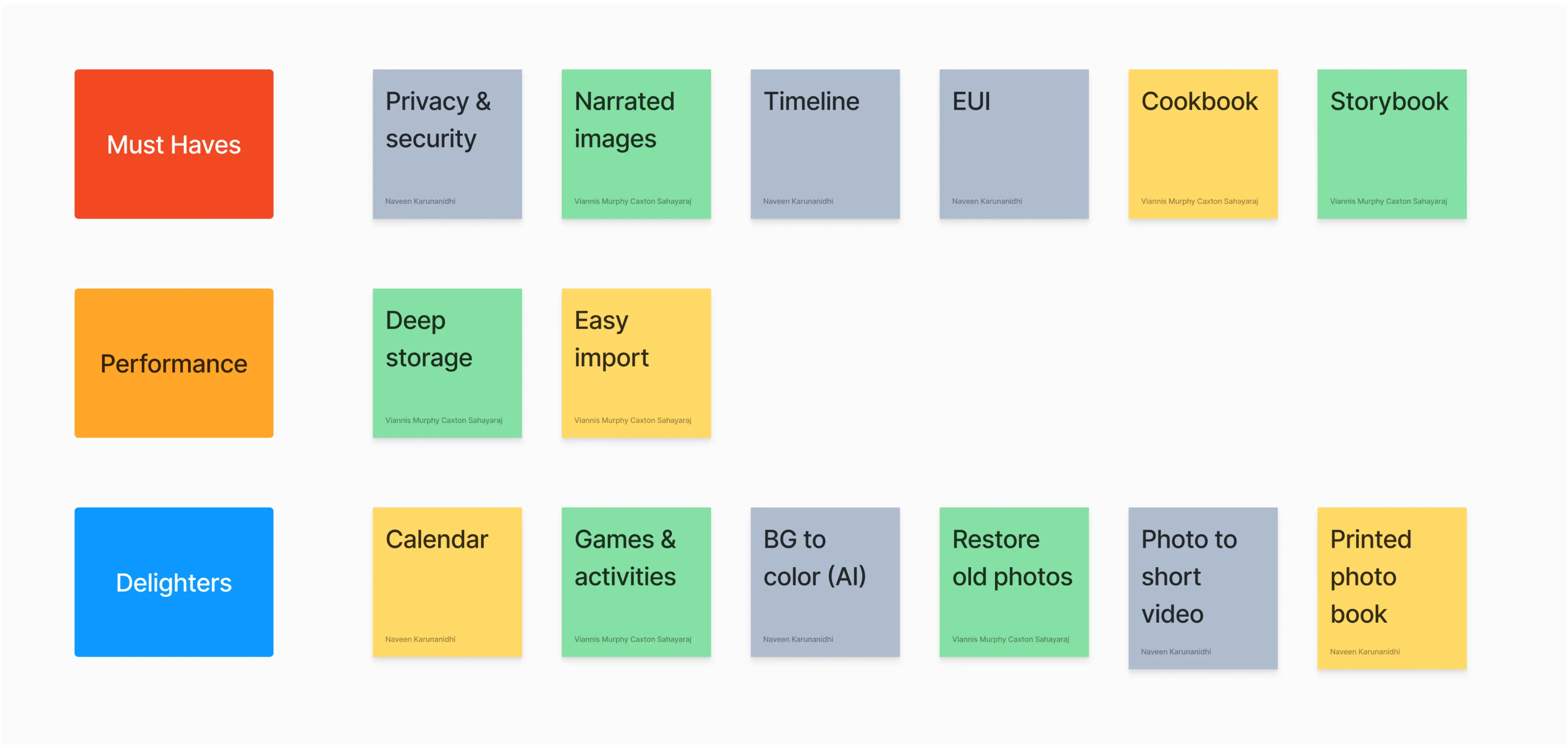
I paired this analysis with KANO-based feature prioritisation, narrowing the surface area to only those capabilities that delivered immediate user value and trust. This research informed an initial hypothesis-led design that emphasised family-first positioning, storage-based pricing clarity, and visual previews of core functionality.

An infographic showing a comparative analysis of Heiroom’s direct and indirect competitors. The analysis is presented in a chart format with six categories: Heiroom (Family Tradition), Non-toxic social media platforms, EUI activities, Recipe sharing platforms, Storybook apps, Deep storage files. Each category includes multiple yellow sticky notes with the names of different platforms or products and their unique selling propositions. Green sticky notes labeled ‘Heiroom’ indicate the unique selling propositions of Heiroom in each category. The chart is organized on a light grey background with a subtle grid pattern.

This is a comparative analysis conducted on both direct and indirect competitors of Heiroom, including their unique selling propositions.

A graphical representation of feature prioritization for Heiroom using the KANO model. The features are categorized into three groups: ‘Must Haves’, ‘Performance’, and ‘Delighters’. ‘Must Haves’ includes features like Privacy & Security, Narrated Images, Timeline, EUI, Cookbook, and Storybook. ‘Performance’ includes Deep Storage and Easy Import. ‘Delighters’ includes Calendar, Games & Activities, BG to Color (AI), Restore Old Photos, Photo to Short Video, and Printed Photo Book.

This was conducted during a stakeholder meeting while identifying the value proposition and unique selling propositions.

Iteration & Validation

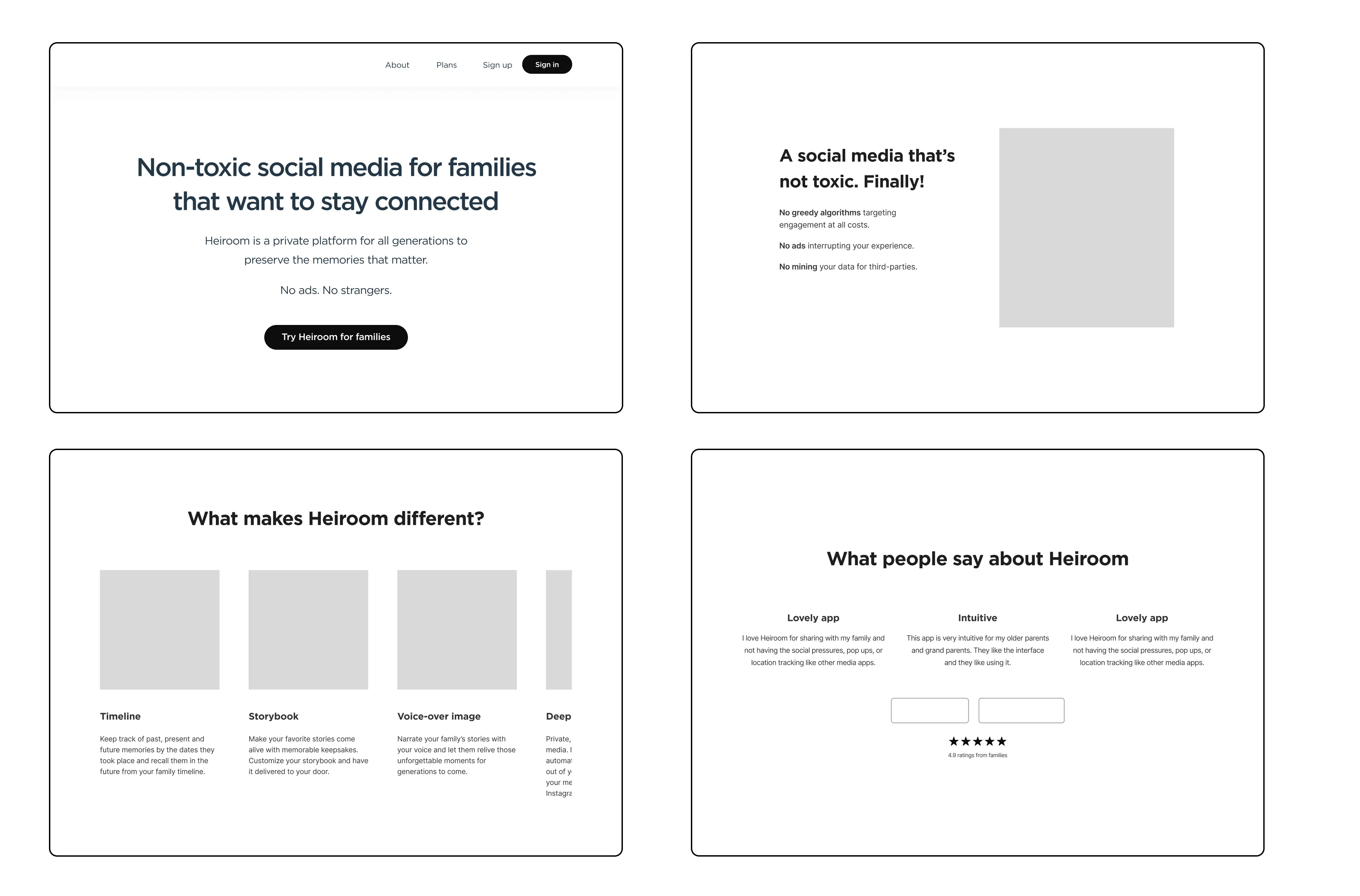
We validated this direction through moderated user testing across key audience segments, using the initial landing page as a testable hypothesis rather than a final solution. Testing revealed three consistent breakdowns: “non-toxic social media” messaging triggered negative associations rather than reassurance, storage-based pricing created confusion around whether plans were per-user or per-family, and static screenshots led some users—particularly older audiences—to misinterpret Heiroom as a storage tool rather than an interactive platform. In response, I iterated the experience as a single cohesive refinement: reframing the narrative around a shared family timeline, clarifying plans as “one room for the whole family,” and introducing lightweight motion to demonstrate interaction and emotional value. This unified iteration shifted perception from utility to connection, directly addressing the trust and clarity gaps surfaced in research.

Wireframe Screens for iteration

Early wireframes testing three hypotheses: (1) "Non-toxic" positioning to differentiate from mainstream platforms, (2) feature-focused differentiation (Timeline, Storybook, Voice-over), and (3) social proof through testimonials. User testing revealed these approaches created unintended confusion rather than clarity.

Goals

Number 1 Bullet Point
Achieve a conversion rate of at least 14%, given that most of the leads are the target audience of Heiroom.
Number 2 Bullet Point
Achieve an adoption rate of 20% for paid subscription plans.

Through three iterations of testing and design, we successfully finalized the landing page that clearly highlights the values families would benefit from Heiroom.

01. Reframed the Value Proposition Around Family Moments

Shifted messaging away from “non-toxic social media” toward a family timeline and shared storybook, reducing negative associations and helping users immediately understand Heiroom as a place to connect, not just store content.

Two sections from Heiroom’s website are positioned side-by-side. The left page, titled ‘Heiroom’, emphasizes the core value proposition of building a family timeline together in an intimate, positive atmosphere. The right page provides more clarity on safety and privacy, stating ‘A safe and private space for your family to engage’ and assuring users there are no greedy algorithms, intrusive ads, or third-party data mining.

02. Simplified Pricing to Remove Cognitive Friction

Collapsed storage- and user-based tiers into a single family plan, addressing confusion around ownership and eligibility while reinforcing the idea of one shared space for the entire family.

An image comparing the old and updated subscription plans for a family-oriented social media platform. The old plan, on the left, shows four red boxes with different pricing tiers and storage information. The updated plan, on the right, presents a cleaner layout with a title ‘One room for your whole family’ at the top. It displays four pricing tiers: Free, Lite, Basic, Plus, each with details about the number of users it can accommodate and storage capacity. This image illustrates the approach of contextualizing storage in relation to family size and clearly distinguishing features, empowering users to make informed decisions about the best plan for their family.

03. Made Interactivity Visible Through Motion

Replaced static screenshots with lightweight GIFs to demonstrate commenting, reacting, and shared storytelling, correcting the perception that Heiroom was passive storage rather than an interactive social product.

An GIF image capturing a cherished memory of two family members sharing a moment during a vacation at grandma’s house on October 8, 1996. This GIF image is a part of the Heiroom family experience, highlighting the platform’s focus on preserving and sharing such precious family moments.
A collage of various user interface designs for the Heiroom, a family-oriented social media platform. The collage showcases features like building a family timeline, providing a safe and private space for family engagement and differentiating factors of the app. The user interface is clean and modern, predominantly white with orange accents and uses images to enhance user engagement.

Results

12%

Conversion rate for signups

Signup conversion increased from <2% to 12% with 6× improvement from where it was

89%

Correct product understandings

Users correctly identified Heiroom as a social platform for families, up from 34% before the redesign.

32%

Paid adoption

32% of users converted to a paid plan, exceeding the 20% target and validating pricing clarity and value framing.

45 seconds

Time to subscription decision

Average time to select a plan reduced from 3.4 minutes to 45 seconds, indicating significantly lower decision friction.

Awards

Heiroom won the Great Lakes Bay Gold Addy Award for Best Consumer Website.

ADDY award

Best Consumer Website

Key takeaways

This work reinforced the importance of validating assumptions early with real users, as initial positioning created unintended confusion despite strong intentions. Iterative testing, paired with disciplined prioritization, allowed the team to focus on what actually moved understanding and confidence rather than layering on features or messaging. Most importantly, the project demonstrated that clarity is a design outcome in itself—when users clearly understand a product’s purpose, both engagement and business performance follow.