Turning Skill Data into Confident Decisions
HR managers had skill data but couldn't interpret it confidently — so they didn't act. I redesigned SkillsAnalysis around progressive disclosure and visual clarity, turning a data-heavy dashboard into a decision-support tool. Result: dashboard completion jumped from 23% to 71%, decision time dropped by 84%, and 7 of 8 managers could now correctly rank candidates (vs 2 of 8 before).
Sole product designer on an 8-week engagement with enterprise client pressure.
6 people: 1 PM, 1 designer (me), 3 engineers, 1 marketing lead. I worked directly with PM to reframe product positioning and with engineering to balance data depth against cognitive load.
SkillsAnalysis aimed to help managers and HR leaders understand workforce capabilities and make better hiring, development, and planning decisions. In practice, the product was failing at its core promise: users had access to large volumes of skill data but lacked confidence in interpreting it. Instead of enabling decisions, the platform created hesitation. When users don't trust their interpretation, they don't act — a fatal flaw for a decision-support product.
Users who opened a skill report struggled with exports, comparisons, and development planning.
Users struggled to articulate skill insights internally, risking adoption and upsell to enterprise clients.
Misinterpretation slowed strategic hiring and L&D decisions across organizations.
If users couldn't confidently explain skill insights internally, the product risked being seen as interesting but non-essential, limiting expansion revenue and long-term adoption.
Through interviews, usability testing, and support data analysis, a consistent pattern emerged: users weren’t struggling due to lack of data, but due to uncertainty in interpretation. Most users questioned whether their reading of skill scores was correct, repeatedly revisiting definitions and abandoning reports without taking action.
This reframed the problem from "how do we show skills better?" to "how do we help users feel confident making decisions from skill data?"
Users should understand the signal before seeing the full dataset
Advanced detail should be available, but never forced
Every view should clearly suggest what to do next
These principles weren’t aspirational — they actively guided trade-offs across hierarchy, interaction depth, and visual emphasis. I anchored the work around one guiding principle:interpretation must come before information. These principles became a shared decision framework across product, data, and engineering, helping us evaluate trade-offs and avoid reverting to data-heavy defaults.
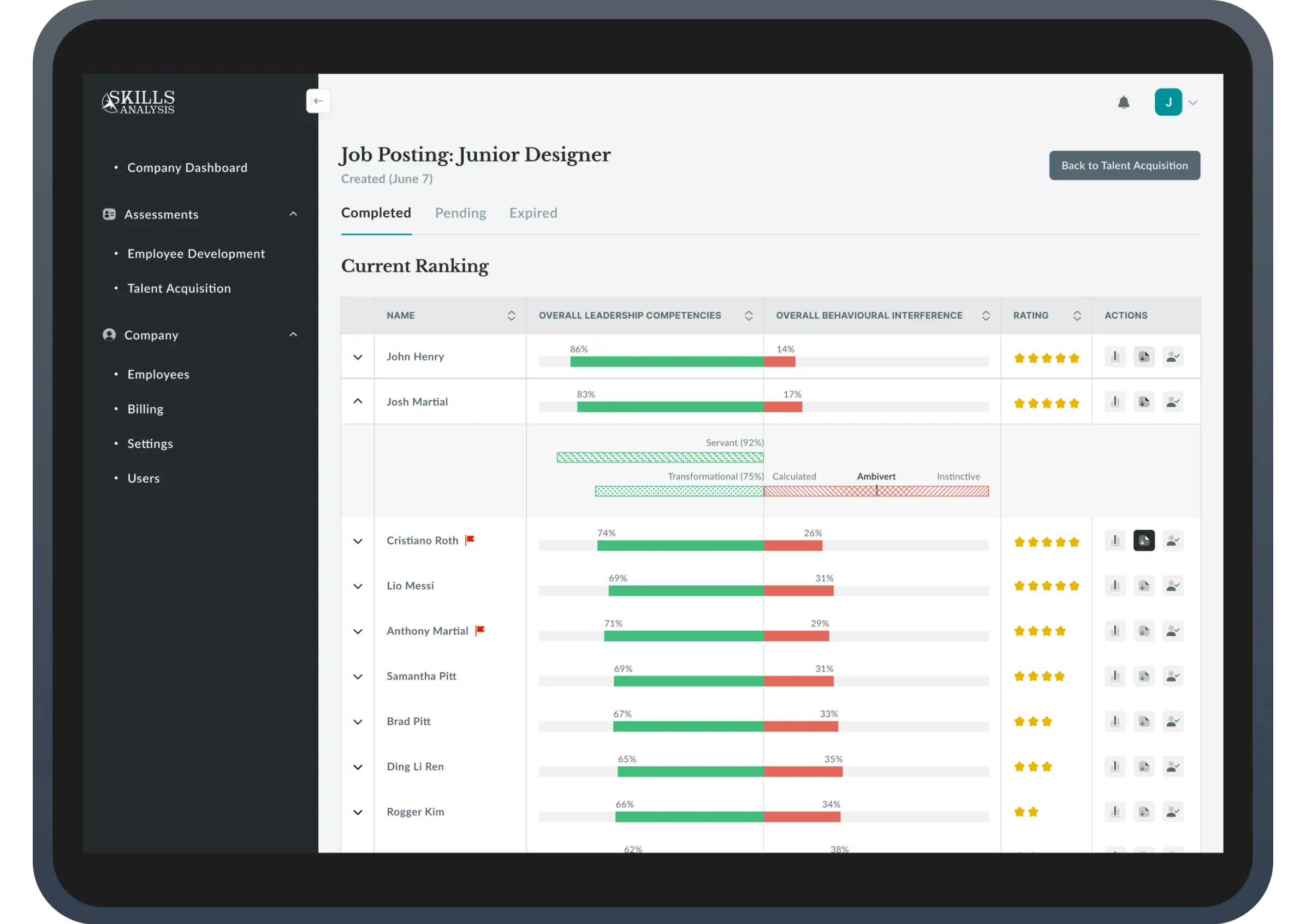
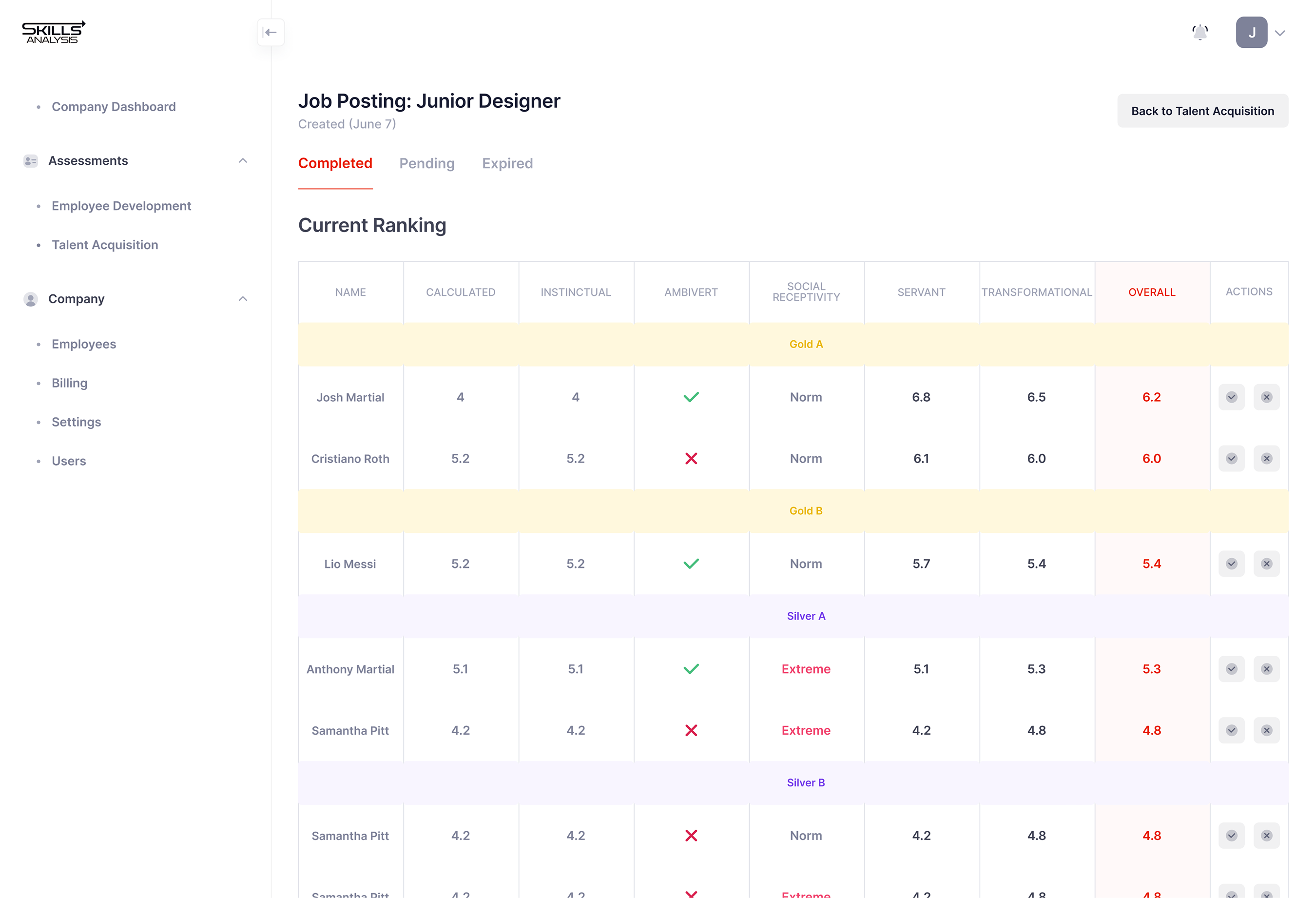
The original table showed 9 columns of raw scores with no hierarchy—users scrolled horizontally, unable to identify which metrics mattered. Only 2 of 8 managers could explain what made a candidate strong.
I restructured the experience into progressive layers. The default view consolidated 9 columns into 4 core signals: horizontal bars showing Leadership (green %) vs Behavioral gaps (red %), 5-star ratings, and expandable rows for detail. Users could now compare candidates instantly—86% green meant strong, no mental math required.
Clicking expand revealed trait-level breakdowns with color-coded patterns: green checkered = strengths, red striped = interferences. This let users answer "Why this rating?" only when they needed to.
Testing with 8 managers: 7 correctly ranked candidates vs 2 before. Time to decision: 4:32 → 0:47 (~84%). Dashboard completion: 23% → 71% post-launch.
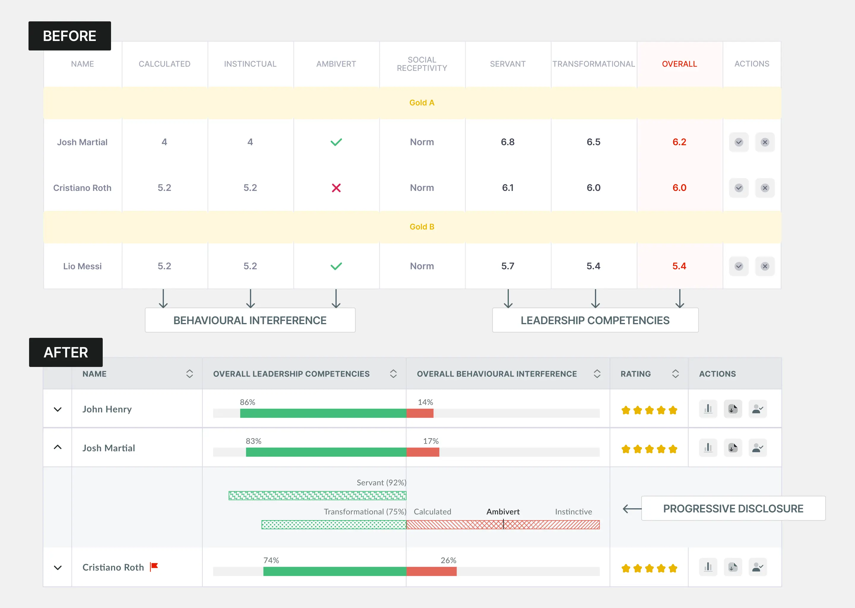
Traits like "Ambivert" and "Extreme" appeared for everyone, but users couldn't interpret them—"Is Extreme bad?" The interface treated context as scores to compare.
I made traits conditional—they only appeared when behaviorally significant. "Extreme" in red text flagged outliers. A red flag icon (🚩) appeared for serious interferences requiring review. Normal traits like "Norm" got no special treatment.
Hover states explained on-demand: "Ambivert: Balances intro/extroverted tendencies."
Before: 6 of 8 ignored traits entirely. After: 8 of 8 noticed flags, 7 clicked for context. Trust in insights: 2.8/5 → 4.1/5

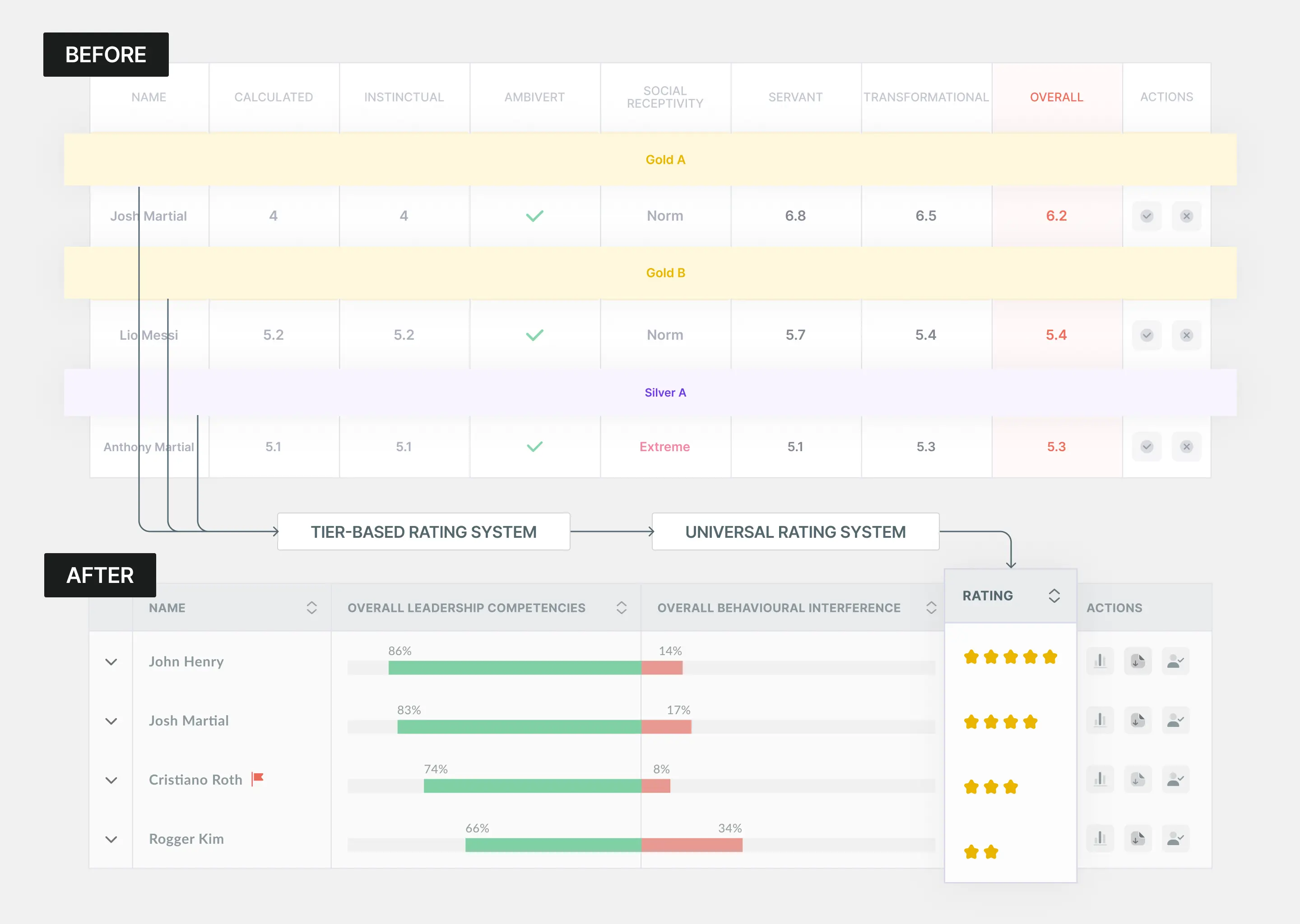
The original design used tiers (Gold A, Silver B) plus numeric scores (6.2, 5.4) that competed for attention. Users asked: "What's the difference?" "Is 6.2 good?" Two rating systems on one screen created confusion.
I replaced tiers with 5-star ratings. Everyone understands stars instantly—no explanation needed. Hover revealed depth for power users: "4 stars: 83% Leadership, 17% gaps."
Before: 5 of 8 asked "What do tiers mean?" After: 0 questions. Time to rank: 3:47 → 1:38.
The Skills Analysis main dashboard for candidate assessment plays a crucial role in summarizing key information about a candidate's leadership competencies and behavioral tendencies that may interfere with them. Despite its importance, the existing dashboard failed to clearly communicate what mattered most, leaving users uncertain rather than confident in their decisions. The newly updated dashboard addresses these challenges by presenting information in a more digestible way, enabling users to make faster and more intuitive decisions.

Increased from 23% to 70% after restructuring skill interpretation
Average time for managers to correctly interpret a skill reduced by 80%
Increased from 30% to 55% as managers revisited skills for planning and comparison
Beyond interface design, my core contribution was reframing the product from data delivery to decision enablement. I established interpretation as a first-class product goal, influenced prioritization across teams, and created a shared language for evaluating complexity versus clarity.
Data doesn't create confidence, interpretation does. Users weren't asking for more data. They were asking "Am I reading this right?" The moment we showed signals instead of scores, hesitation disappeared.
Universal patterns beat proprietary systems. We had a clever tier system (Gold A, Silver B). Users didn't understand it. We replaced it with 5-star ratings. Zero questions. Familiarity is a feature.
Hiding information can increase usability. Showing 9 columns felt "complete." Showing 4 columns with expandable depth felt "clear." We removed data to add confidence. The 78% who never expanded proved the summary was sufficient.
SkillsAnalysis now helps individuals interpret data. The next opportunity is enabling team-level decisions.
The foundation is individual clarity. The next phase is organizational intelligence.